How to Hang and Arrange Artwork at Home
A Practical Guide to Scale, Height and Gallery Walls
A home can have good furniture, pleasant light, carefully chosen colours and still feel unfinished if the walls are empty. Artwork gives a room memory. It tells you something about the people who live there. It can bring in travel, landscape, family history, humour, atmosphere, colour and silence.
Yet hanging artwork is one of those things people delay for years. The reason is usually simple: a nail hole feels too final. You can move a chair five times in an afternoon, but once you put a hook in a wall, it feels like a decision has been made.
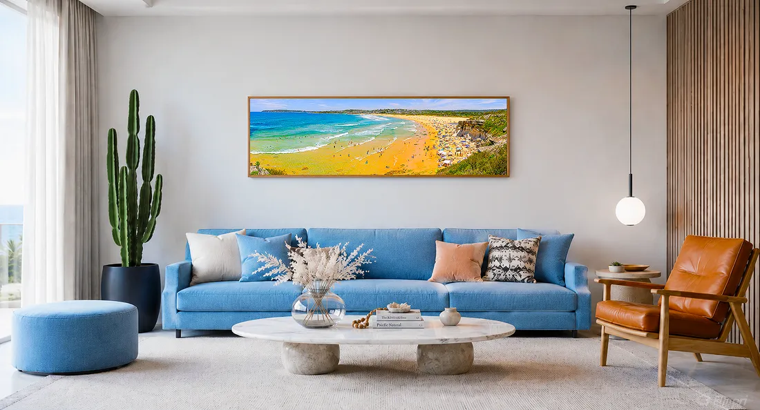
Artwork can turn a well-furnished room into a space that feels personal and complete. A large panoramic print above the sofa gives the wall purpose, adds colour and atmosphere, and helps the whole room feel more settled.
The good news is that hanging art is much less mysterious than it appears. You do not need a perfect eye or a designer's instinct. A few reliable measurements solve most of the anxiety. Start with the centre height. Check the relationship to furniture. Keep grouped pieces close enough to read as one composition. Test a gallery wall before you hammer anything in. Then make the wall part of the home rather than a blank space you keep meaning to deal with later.
This guide is about the practical side of hanging artwork: how high to place it, how far apart pieces should be, how to arrange pictures above furniture, how to plan a gallery wall, and how to avoid the mistakes that make even good artwork feel awkward.
Before getting into measurements and layouts, it is worth remembering why artwork matters in the first place. The right piece does more than fill a blank wall; it can make a room feel calmer, warmer and more personal. I explore this more deeply in Art for Private Homes, which looks at how fine art photography and wall art can help turn a house or apartment into a more personal sanctuary.
Start with the purpose of the wall
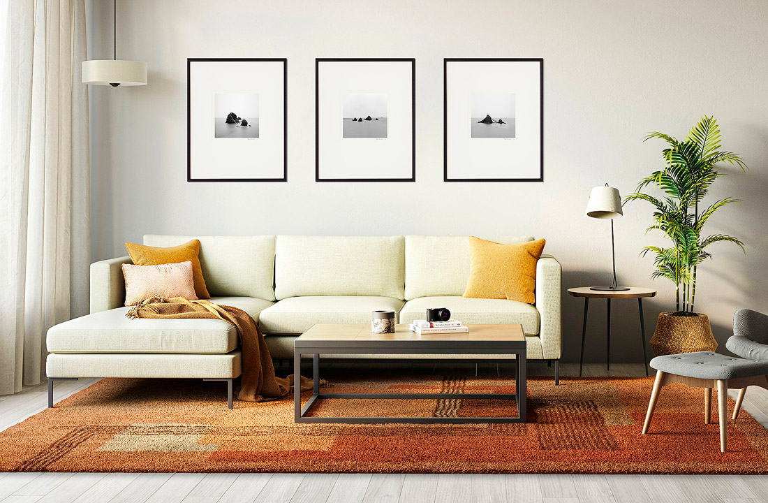
Before measuring height or spacing, decide what the wall needs to do. Here, a quiet triptych above the sofa creates rhythm and balance, giving the seating area a clear focal point without overwhelming the room.
Before measuring anything, pause for a moment and ask what the artwork is meant to do in the room.
A single large print above a sofa has a different job from a hallway gallery. A calm grid of black-and-white photographs above a console feels different from a loose wall of travel images collected over many years. A large landscape print in a bedroom may be there to create quiet. A group of family photographs in an entryway may be there to make the home feel personal as soon as someone walks in.
This matters because the rules change slightly depending on the purpose. A single piece needs enough scale to hold the wall. A group needs internal rhythm. A hallway gallery must survive people walking past it every day. Artwork in a dining area may need to be a little lower because it is mostly seen while people are seated.
The practical measurements will help, but they work best when you know the role of the artwork first.
The 145 cm principle: the simplest starting point
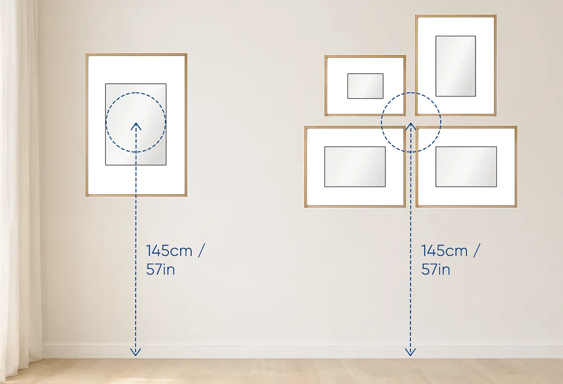
The 145 Principle for hanging artwork. The centre of the artwork, or the centre of a grouped arrangement, should sit about 145 cm / 57 inches from the floor. This is generally considered a comfortable and visually pleasing viewing height for most people.
The most useful rule for hanging artwork is the 145 cm principle.
The centre of the artwork, or the centre of the whole arrangement, should sit around 145 cm from the floor. In American measurements, this is roughly 57 inches to the centre. The measurement is taken to the centre of the artwork, not to the top of the frame and not to the hanging hook.
This rule is useful because it relates artwork to human eye level. People often make the mistake of hanging art to suit the height of the wall. A tall ceiling can trick you into moving everything up. The problem is that people do not become taller just because the ceiling is high. Artwork usually feels best when it relates to the viewer first, then to the architecture.
For a single artwork on a blank wall, 145 cm to the centre is a very good starting point. For a group of artworks, treat the whole group as one large artwork and place the centre of that group at roughly 145 cm.
Before measuring, spacing and hanging artwork, it is worth making sure the piece itself is right for the room. Size, subject, mood, natural light and viewing distance all affect whether a print feels balanced once it is on the wall. For more guidance on choosing the artwork before you hang it, see my guide to choosing fine art photography and wall art for Australian homes and apartments.
How to calculate the hanging point
For a single framed artwork, the basic calculation is:
- Measure the height of the artwork, including the frame.
- Divide that number by two.
- Add that number to 145 cm.
- Measure the distance from the top of the frame to the hanging wire or hook position when the wire is pulled taut.
- Subtract that distance.
- The result is where the hook should go on the wall.
For example, if the framed artwork is 80 cm tall, half of that is 40 cm. Add 40 cm to 145 cm and you get 185 cm. If the hanging wire sits 10 cm below the top of the frame when pulled upward, place the hook at 175 cm from the floor.
This sounds fiddly the first time, but it saves the classic mistake of putting the hook where you want the top of the frame to sit. The hook is rarely at the top of the artwork. The hanging hardware changes the final position.
When to adjust the 145 cm rule
The 145 cm rule is a starting point, not a law. Real rooms have sofas, beds, consoles, lamps, switches, mouldings, windows, air-conditioning units and awkward corners.
Adjust the height when:
- the artwork sits above furniture;
- the piece is viewed mostly while seated;
- the sofa back or bedhead is unusually high or low;
- the ceiling is unusually low or very high;
- an architectural feature interrupts the wall;
- the artwork is part of a staircase or hallway sequence.
The rule gives you a sensible default. The room then tells you how much to move from that default.
Hanging art above furniture
Artwork almost always looks better when it has a visual relationship with the furniture below it. A print above a sofa should feel connected to the sofa. A photograph above a bed should feel anchored to the bedhead. A small artwork above a console should feel like part of that entryway arrangement.
The common mistake is leaving too much empty wall between the furniture and the artwork. The piece then floats in a strange middle zone: too high to belong to the furniture, too low to feel intentionally placed on the wall.
The two-thirds rule
When hanging art above furniture, a good rule of thumb is that the artwork or grouping should be about two-thirds the width of the furniture below it.
For example:
- above a 210 cm sofa, an artwork or grouping around 140 cm wide will usually feel balanced;
- above a queen bed, one large horizontal piece or a pair of framed works can work well if the overall width is roughly two-thirds of the bedhead;
- above a console, the artwork can be smaller, but it should still feel connected to the width of the furniture.
The artwork should usually not be wider than the furniture. There are exceptions, of course, especially with very minimal furniture or deliberately dramatic interiors, but as a general rule it is safer to keep the art slightly narrower than the piece below it.
This is especially important with photographic prints. A large landscape photograph above a sofa can look wonderful, but it needs enough width to hold the wall. Too small and it starts to look like a postcard. Too wide and it can overpower the furniture.
How high above a sofa?
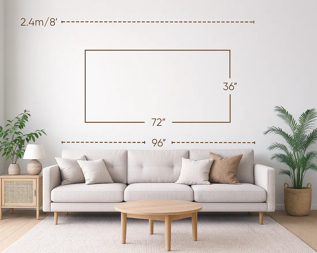
A good starting point above a sofa is to leave roughly 15 to 30 cm (6 to 12 inches) between the top of the sofa and the bottom of the artwork. Lower placement feels more anchored; slightly higher placement gives the wall a little more breathing room.
For artwork above a sofa, leave roughly 15 to 30 cm between the top of the sofa back and the bottom of the artwork. In inches, that is about 6 to 12 inches.
The lower end of that range makes the artwork feel more connected to the sofa. The higher end gives more breathing room, which can work if the artwork is large, the sofa back is high, or the room needs a little more openness.
A useful test is to sit on the sofa and lean back naturally. The artwork should not feel as if it is about to touch your head, and the frame should not make people nervous when they sit down. At the same time, it should not be so high that it looks unrelated to the sofa.
If you are also unsure about width and proportion, see Choosing the Right Wall Art Size for a Three-Seater Sofa, where I break down how wide the artwork should be in relation to the sofa and when to use one large piece instead of two or three smaller ones.
How high above a bed?
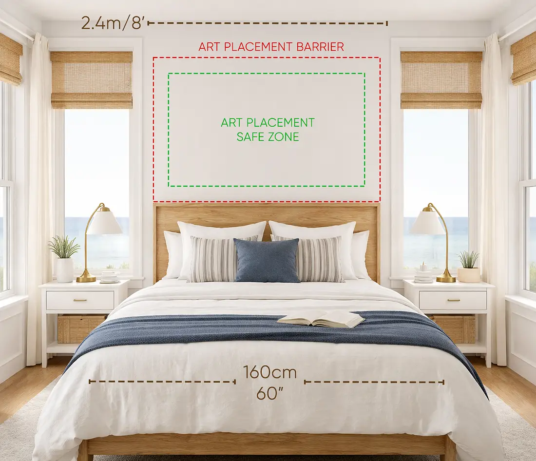
A large horizontal artwork often works well above a bed, especially when it is centred over the bed and placed close enough to feel anchored. As a guide, leave about 10 to 20 cm between the top of the bedhead and the bottom of the frame.
Above a bed, the artwork can usually sit a little closer to the bedhead. A useful range is about 10 to 20 cm, or 4 to 8 inches, between the top of the bedhead and the bottom of the frame.
Bedrooms often benefit from a calmer, more anchored arrangement. A large horizontal piece above the bed can work beautifully, especially if the artwork is quiet enough to live with at night and strong enough to hold the wall during the day.
If the bed has no bedhead, treat the pillows and bedding as the visual anchor. The artwork may need to sit slightly lower than it would on a completely blank wall, but still high enough that pillows do not touch it.
For size and proportion, I cover this in more detail in Choosing the Right Wall Art Size Above a Queen Bed, including how wide the artwork should be in relation to the bed and when one large piece works better than a pair or trio.
Above a console, dresser, buffet or entry table
For smaller furniture pieces such as a console, dresser, buffet, vanity or entry table, the gap can often be smaller, around 10 to 18 cm, or 4 to 7 inches.
The reason is simple: these are usually compact compositions. The furniture, lamp, bowl, books, flowers and artwork all read together. If the artwork is too high, the little scene falls apart.
For a console in an entryway, try thinking of the whole arrangement as one vertical composition. The console anchors the bottom. A lamp, vase or object creates the middle. The artwork completes the top. The wall will feel more deliberate if the parts overlap visually rather than sitting in separate zones.
Above a desk
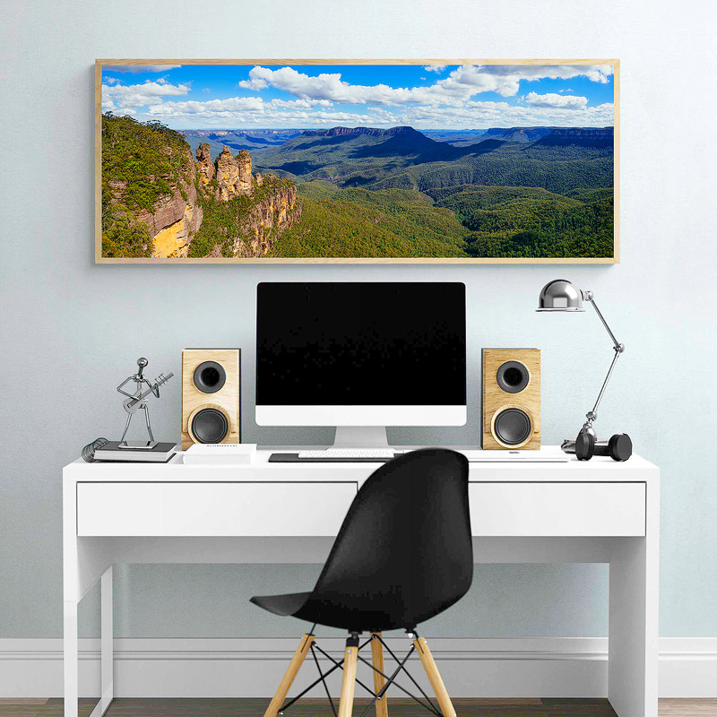
Artwork above a desk should feel connected to the workspace without competing with the screen or everyday desk items. Leave enough practical clearance so the frame feels calm and stable, not like something you might bump while working.
Artwork above a desk needs a bit of practical clearance. A range of about 18 to 35 cm, or 7 to 14 inches, often works.
A desk has movement: screens, notebooks, lamps, arms, coffee cups and the general mess of working life. The artwork should feel close enough to belong to the desk area, but not so low that it competes with the screen or gets bumped.
If the desk is used daily, choose either a single calm piece or a small group with stable hanging hardware. A constantly crooked frame above a work desk becomes irritating very quickly.
Spacing between artworks
Spacing is one of the main reasons a group of pictures either feels intentional or random. When pieces are too far apart, they stop reading as a group. When they are too close without enough care, they can feel cramped.
For most picture walls, 5 to 10 cm between frames is a reliable range. In inches, that is about 2 to 4 inches.
For a tighter salon-style gallery wall, the spacing can be closer, around 4 to 6 cm, or 1.5 to 2.5 inches. This creates a denser, more collected feeling.
For a row of pictures down a hallway, above a sectional sofa, or along a long wall, 7 to 15 cm, or 3 to 6 inches, can work well. Less than that may not visually separate the pieces. More than that can make them feel disconnected.
The important thing is consistency. The frames do not all need to be the same size, and the images do not all need to match, but the spaces between them should feel deliberate.
Gallery walls: collected, planned and allowed to evolve
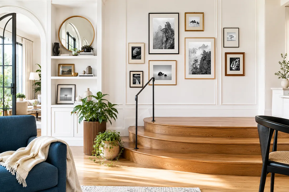
A gallery wall does not need to fit inside a perfect square. Let the arrangement grow around one main piece, using theme, mood, colour or personal meaning to hold the composition together.
A gallery wall is a group of artworks, photographs, prints or objects arranged as one composition. It can be formal or relaxed. It can be a neat grid, a loose salon wall, a personal archive, a travel wall, a family wall or a collection of landscapes from places that matter to you.
The strongest gallery walls have a reason to exist. They are not just a way to use every spare frame in the house. There might be a theme, a mood, a colour story, a personal history or one main piece that everything else supports.
Start with a main character
A good way to begin a gallery wall is to choose the most important piece first.
This could be the largest artwork, the strongest photograph, the most emotionally important image or the piece that best sets the mood for the room. Place that piece first, usually somewhere near the centre of the arrangement, then build around it.
The supporting pieces should not all compete for attention equally. Some can be quieter. Some can be smaller. Some can act almost like punctuation. A gallery wall works better when there is hierarchy.
Use three broad sizes
When mixing frame sizes, try using three broad sizes: large, medium and small.
The medium size is useful because it bridges the difference between the largest and smallest pieces. Without that middle size, a gallery wall can start to look like a few big frames surrounded by little leftovers.
You can also rotate frames. The same frame size can be used vertically in one place and horizontally in another. This adds variety without creating too many unrelated dimensions.
Decide on the overall shape
Before making holes, decide whether the gallery wall should have a clean outer shape or a looser one.
A box-shaped outline means the outside edges of the arrangement form an overall square or rectangle. This is useful when you want a mixed gallery wall to feel calm. The frames inside can vary, but the outer boundary gives the wall order.
A wave-shaped or fluid outline feels more organic. The edges are uneven, but the wall still has movement. This works well for a collected wall that may grow over time.
A grid is the calmest option. It suits matching frames, related photographs, botanical prints, family portraits or any series where repetition is part of the effect.
A salon-style wall is denser and more energetic. It can combine different sizes and subjects, and it often feels as though it has been built over years. It is a wonderful approach when the collection is meaningful, but it usually requires more pieces than people expect.
Keep the group close enough
A gallery wall needs visual gravity. The pieces should sit close enough to pull toward one another.
For many gallery walls, keep frames around 5 to 10 cm apart. For a dense salon wall, go tighter. Avoid gaps larger than 15 cm unless the wall is very large or the pieces are very large. Big gaps make the artworks behave like separate islands.
Let a gallery wall grow
A picture wall does not have to be finished in one weekend. In fact, many of the best ones are built slowly.
Start with the pieces you care about. Hang them well. Leave room for the collection to evolve. It is better to have a smaller wall of meaningful work than a large wall filled with weak pieces bought only to complete the layout.
This is especially true with photographic art. A wall of travel photographs, landscapes, family images or collected prints should feel like a life being slowly edited into view. It does not need to look as though everything came from the same shop on the same afternoon.
Planning walls of pictures: useful layout patterns
When you are arranging more than one piece, it helps to choose a simple organising idea. The following patterns work because they give the eye something to follow.
Midline
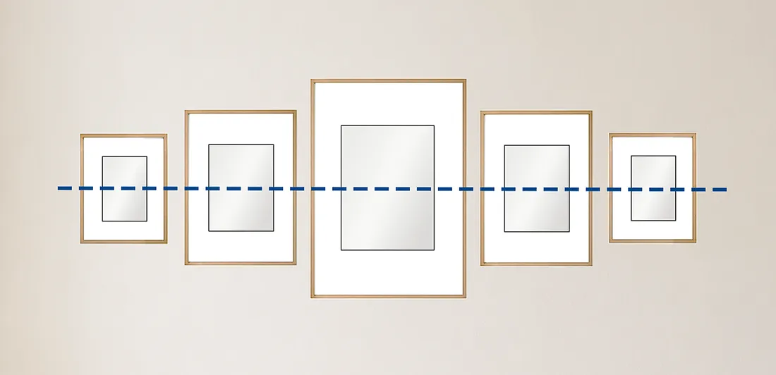
Hanging pictures in a row so that the midlines of all pictures line up.
In a midline arrangement, the centre lines of all pictures align. This works well when the frames are different sizes but you still want the row to feel calm. It is useful along a hallway, above a long piece of furniture, or anywhere the eye should move smoothly across the wall.
Base line
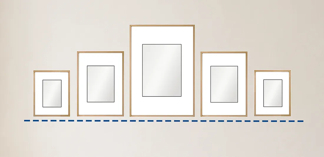
Hanging pictures in a row so that the base lines of all pictures line up. This works with both regular and irregular frame shapes.
In a base-line arrangement, the lower edges of the frames align. This feels grounded and stable. It works well above a console, shelf, sofa or ledge because the lower edge of the artworks creates a strong horizontal anchor.
Top line
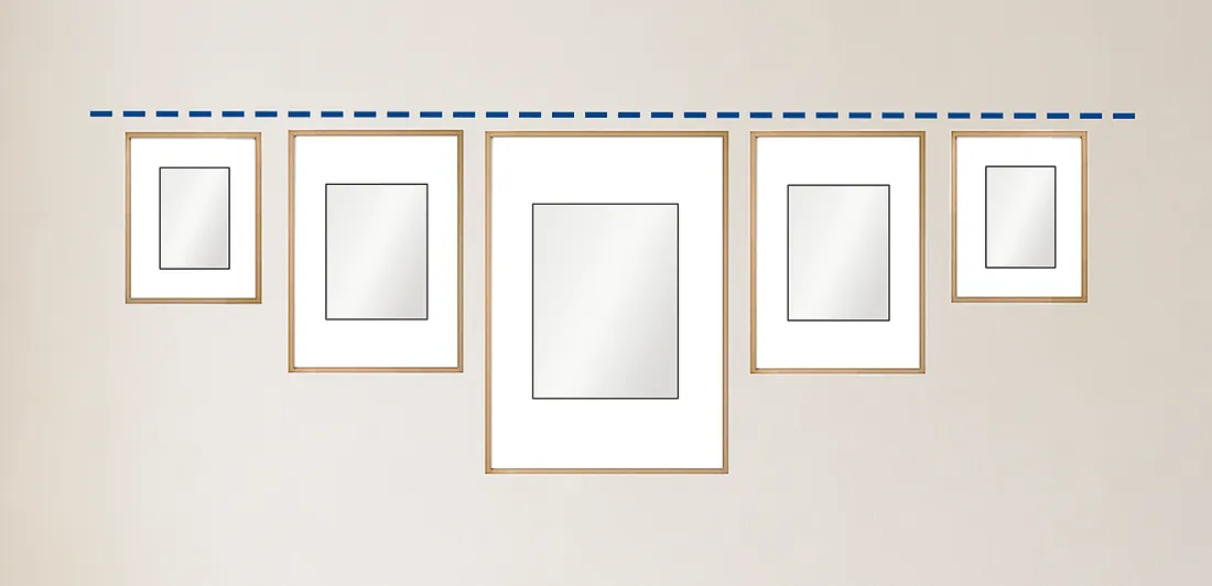
Hanging pictures in a row so that the top lines of all pictures line up.
In a top-line arrangement, the upper edges of the frames align. This is useful when there is an architectural line nearby, such as a shelf, beam, window frame or moulding. It creates a clean upper boundary.
Leading line
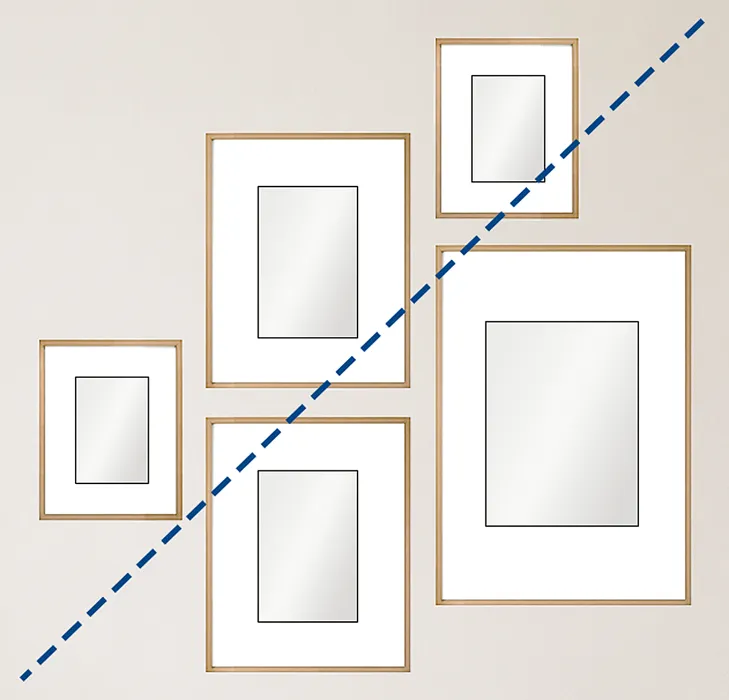
Arrange the pictures so the viewer's eye naturally moves upward on a diagonal. Combine vertical and horizontal frames to keep the composition varied, and keep the spacing between frames consistent. A gap of around 5–10 cm, or 2–4 inches, usually works well.
A leading-line arrangement guides the eye diagonally upward. Mix vertical and horizontal frames, but keep the spacing consistent. This layout creates movement and can work well in a hallway or on a wall where you want the display to feel more dynamic.
Plumb line
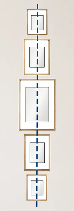
Hang the pictures one above another, aligned to a central vertical line, whether the frames are the same size or varied. This arrangement works well with both regular and irregular frame shapes, and is especially useful for narrow wall spaces, such as the area between two doors.
A plumb-line arrangement places pictures directly above one another along a central vertical line. This is excellent for narrow wall sections, such as the space between doors or windows. It gives an awkward strip of wall a simple purpose.
Box-shaped outline
A box-shaped outline lets different-sized frames form one larger square or rectangle. The eye reads the outside shape first, so the variety inside feels controlled.
Wave-shaped outline
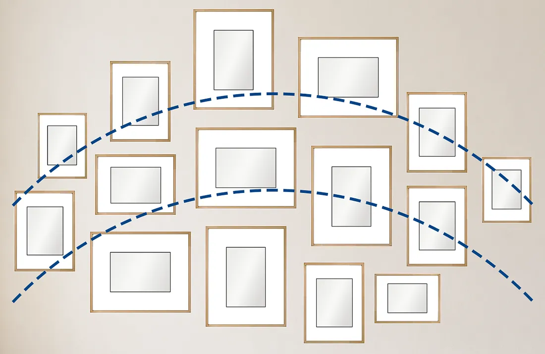
When you have frames in many different sizes and want to avoid a stiff, angular layout, arrange the pictures in a loose wave pattern. Start with one picture as the visual anchor, then place the others along gentle curved lines flowing out from it. This helps the whole arrangement read as one composition, even if the outside edges remain irregular.
A wave-shaped outline uses one piece as a hub, then curves other pictures around it. This is useful when you have many frame sizes and want the wall to feel softer and less angular.
Staircase outline
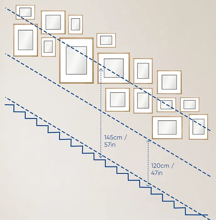
A picture wall along a staircase can make the space feel taller and more dynamic. The key is to use a series of similar pictures in a repeated rhythm, while letting the arrangement follow the upward line of the stairs. Measure from each step to the lower edge of the frame, then use that measurement to create a consistent centre line that rises with the staircase.
For a staircase wall, let the arrangement follow the rise of the stairs. This works especially well with similar pictures or repeated frame styles, because the rhythm of the frames reinforces the movement of the staircase. Measure a consistent distance from each step to the bottom edge of each frame, then use that measurement to create a rising midline that mirrors the angle of the stairs.
Cheek by jowl
A very tight arrangement can make many small pieces read almost as one larger artwork. This can be dramatic and charming, especially with old photographs, drawings, small prints or a dense collection. Use it where the frames will not be constantly bumped.
The floor trick, the tape trick and the photo trick
Do a dry run before hammering anything into the wall.
The floor trick is the easiest start. Lay the frames on the floor in front of the wall where they will hang. Move them around. Test the spacing. Remove the weak pieces. Try a grid, then try something looser. You will usually see the problem faster on the floor than on the wall.
The tape trick is more accurate. Trace each frame onto kraft paper, wrapping paper or spare cardboard. Cut out the shapes, label them, then tape them to the wall with painter's tape. This lets you see the arrangement at full scale without making holes.
The photo trick is simple and surprisingly useful. Each time you create a layout you like, take a photo. Then change the layout and take another. Comparing photos makes the decision easier because you stop relying on memory. It also gives you permission to dismantle a promising arrangement without worrying that you will never recreate it.
Once you choose the layout, mark the hanging points directly through the paper templates. Remove the paper, install the hooks, and hang the artworks.
The Chicken Test for hallways and staircases
Hallways and staircases can make excellent gallery spaces, but they have one practical problem: people move through them. Bags, elbows, shoulders, washing baskets and vacuum cleaners can all knock frames out of alignment.
The Chicken Test is a simple way to check whether a narrow space is suitable for a picture wall.
Stand in the hallway or staircase. Put your thumbs in your armpits. Flap your elbows like chicken wings while walking through the space. If your elbows hit the wall, the area is probably too narrow for framed artwork.
It sounds ridiculous, which is why it works. A gallery wall only looks good if the frames stay level. In a tight corridor, one bumped frame can make the whole wall look messy. If the Chicken Test fails, consider a single flush-mounted piece, a narrow ledge, a more durable wall treatment, or leaving that section alone.
Room-by-room examples
Above a sofa
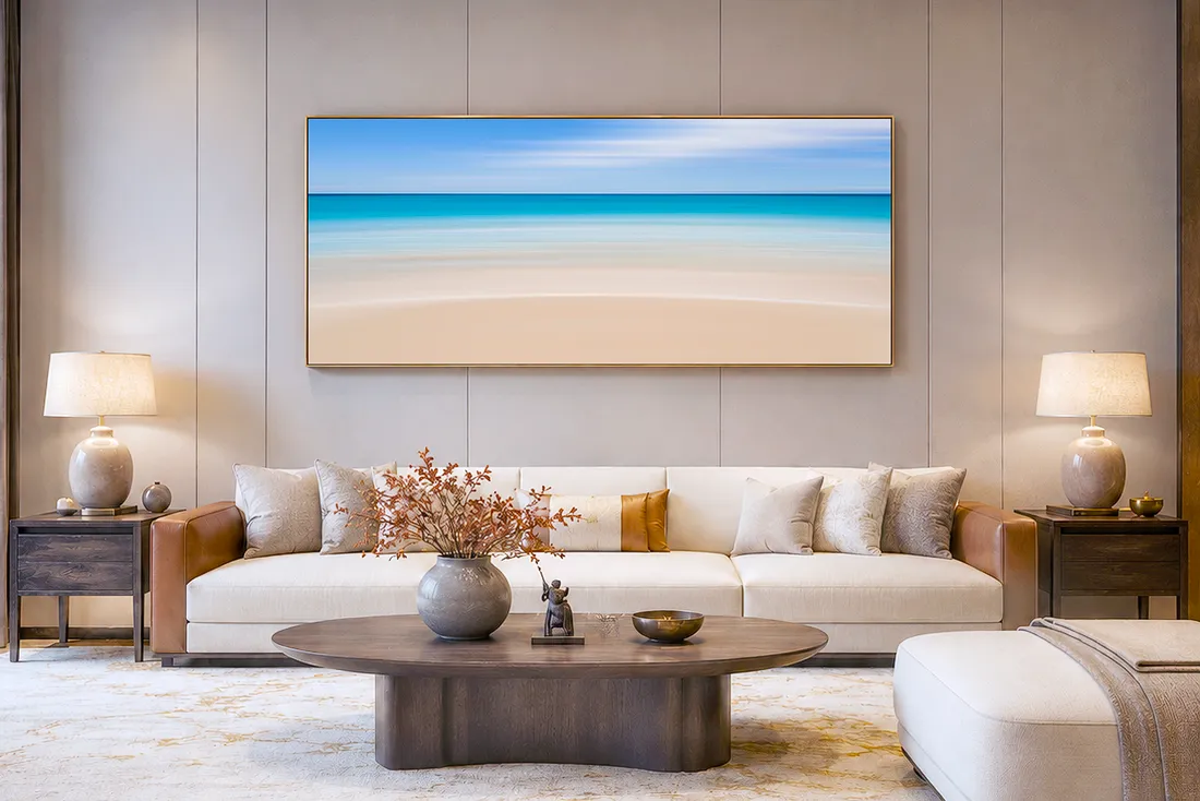
A large horizontal artwork works especially well above a sofa because both shapes reinforce each other. As a guide, aim for the artwork or grouping to be around two-thirds of the sofa width, with about 15 to 30 cm between the sofa back and the bottom of the frame.
Use one large artwork, a pair, a triptych or a gallery grouping. Aim for the overall width to be around two-thirds of the sofa width. Leave about 15 to 30 cm between the sofa back and the bottom of the frame.
A large horizontal landscape photograph can work particularly well here because the sofa is also a strong horizontal shape. The artwork and sofa begin to read as one composition.
Avoid placing a small frame alone above a large sofa. It will look lost. Use a larger print, a wider frame and mat, or a group of pieces.
Above a bed
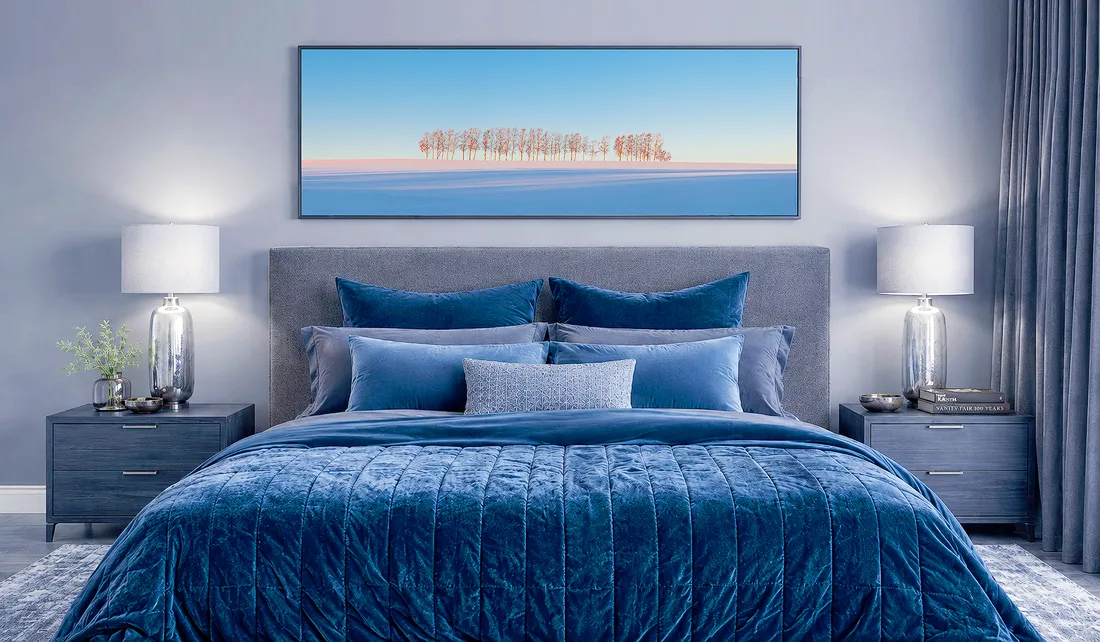
A bed creates a strong horizontal anchor, so a wide landscape artwork can feel especially natural above it. Keep the piece calm, centred and connected to the bedhead, with roughly 10 to 20 cm between the bedhead and the bottom of the frame.
A bed already creates a strong horizontal anchor. The artwork should feel calm and connected to it. Leave roughly 10 to 20 cm between the bedhead and the bottom of the artwork.
One large piece can make the room feel settled. A pair of works can create symmetry. A soft grid can work if the bedroom is simple and the frames are quiet.
Avoid hanging heavy glass-framed pieces insecurely above a bed. Use proper hardware, and consider professional hanging for large or heavy work.
Hallway
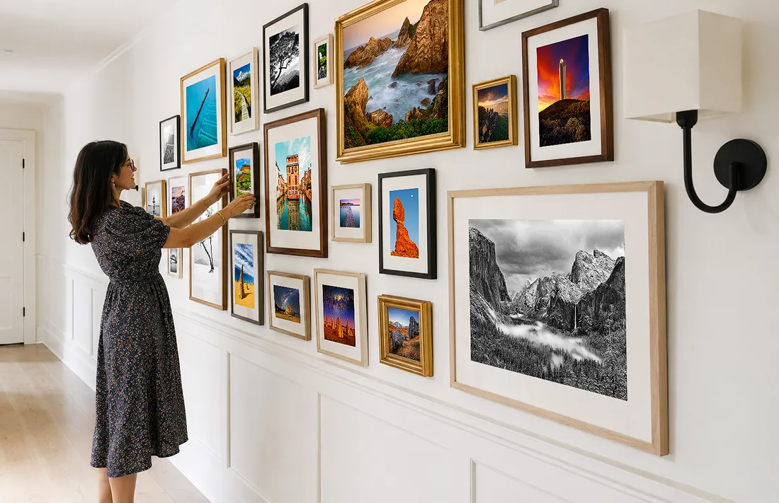
A hallway can become a small private gallery, especially with photographs and artworks that reward close viewing. Keep the spacing consistent and make sure the wall passes the Chicken Test: people should be able to walk past comfortably without brushing the frames.
A hallway can become a small private gallery. It works well for a sequence of related photographs, black-and-white prints, travel images, family pictures or smaller artworks that reward close viewing.
Use consistent spacing. A row can align by centre line, top line or base line. A narrow wall between doors can use a vertical plumb-line arrangement.
Before committing, use the Chicken Test. If the hallway is too narrow, frames will be bumped constantly. In that case, choose fewer pieces, slimmer frames, or a different wall.
Dining room
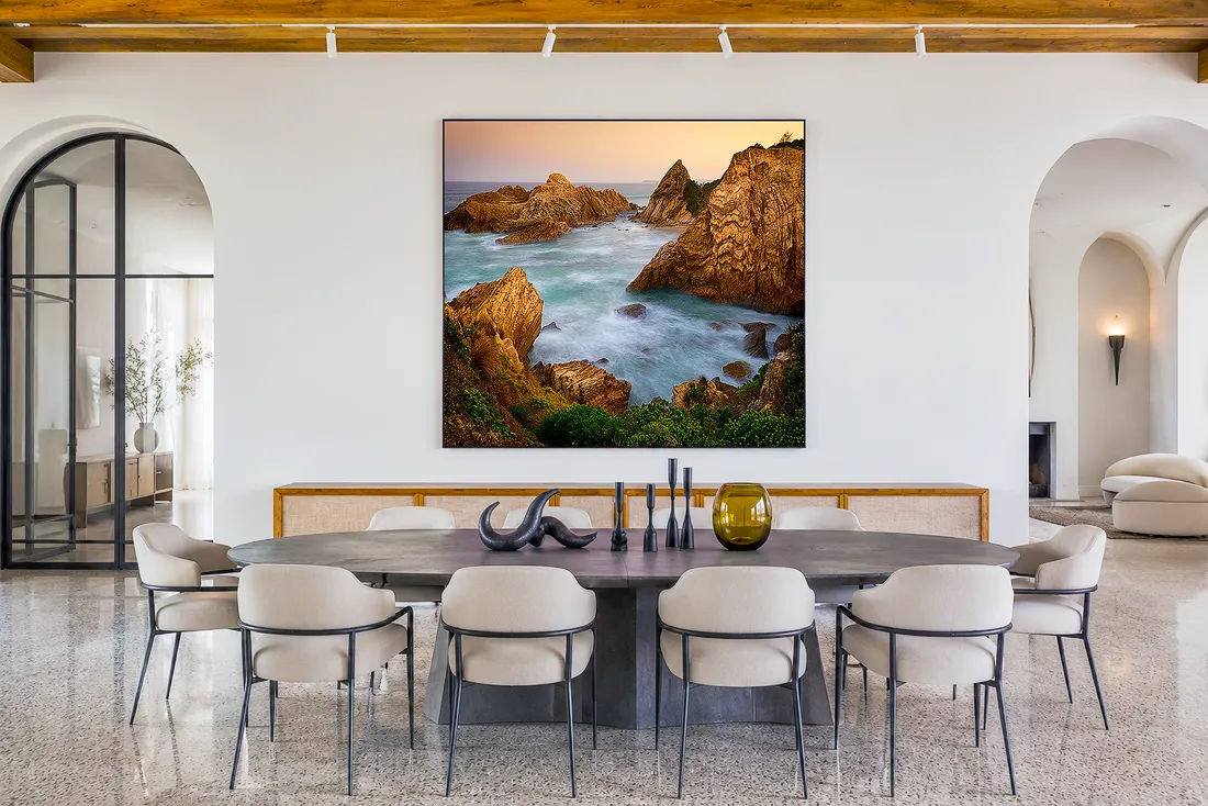
In a dining area, artwork can often sit slightly lower because the room is mostly viewed from a seated position. Leave enough space above nearby chairs so guests can sit and move comfortably, while keeping the artwork visually connected to the table and sideboard.
Dining areas are viewed from seated positions, so artwork can sit slightly lower than it would in a hallway or living room.
For artwork behind a dining table, place a dining chair against the wall and leave about 7 to 15 cm between the top of the chair and the bottom of the artwork. This helps prevent guests from bumping the frame when they push their chair back.
A dining room can handle stronger artwork because people spend time sitting with it. A single atmospheric photograph, a pair of prints, or a compact salon wall above a sideboard can all work well.
Staircase
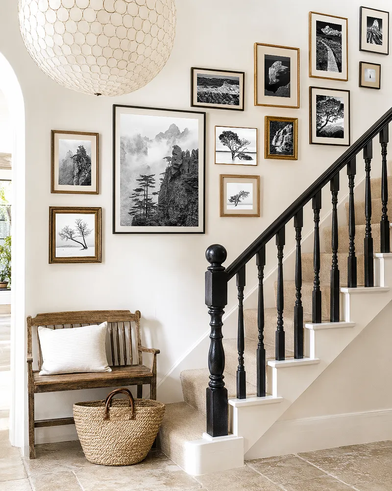
On a staircase wall, the frames should climb with the architecture. A repeated rhythm of related photographs helps the gallery feel intentional, while the rising arrangement follows the movement of the stairs instead of fighting it.
A staircase wall should follow the rise of the stairs. The frames should climb with the architecture rather than fighting it.
A good method is to measure a consistent distance from each stair tread to the bottom of each frame. That repeated measurement creates a rising line. Similar frames or related images usually work best because the staircase already adds movement.
Staircase installations can be awkward to hang safely, especially with large pieces or high walls. This is one area where professional help is often worth it.
Entryway
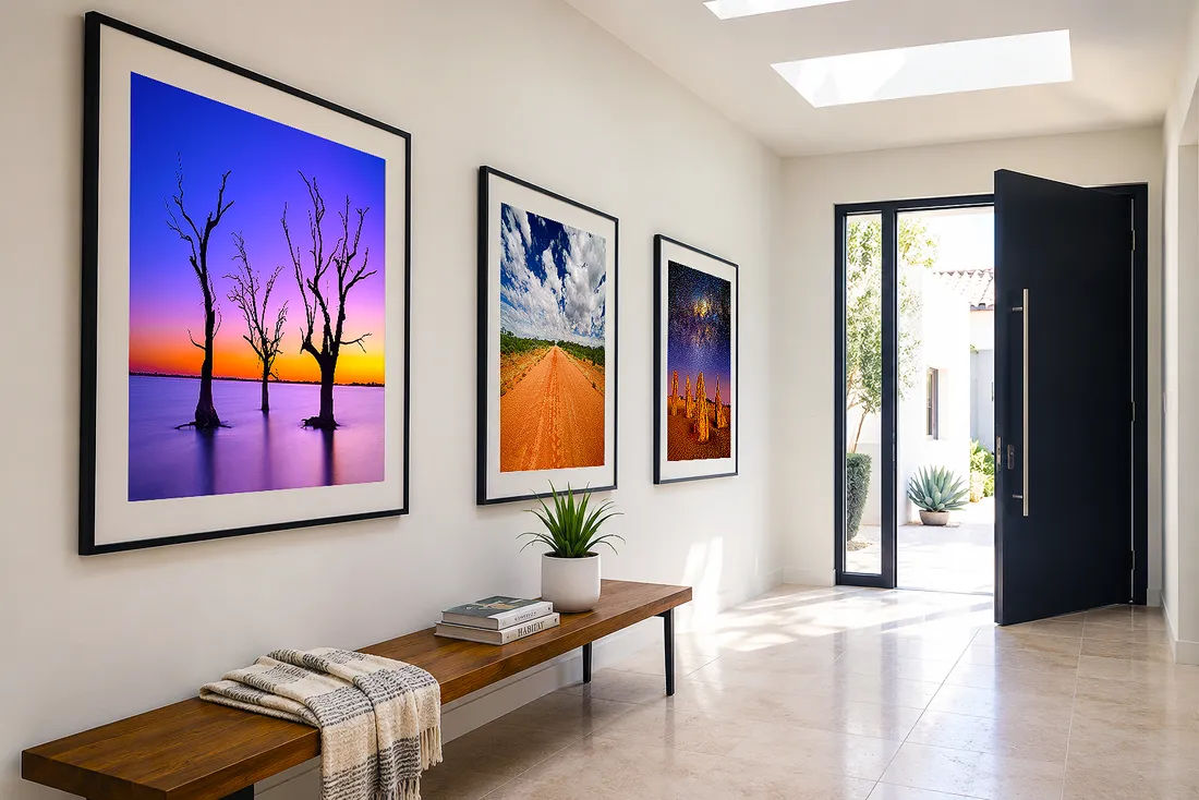
Entryway artwork should set the tone without crowding the space. A small series of framed landscapes above a bench or console can make the entrance feel considered and personal, while still leaving the walkway clear and easy to move through.
An entryway sets the emotional tone of a home. The artwork here does not need to be large, but it should feel intentional.
A single piece above a console is a classic choice. Keep the bottom of the frame fairly close to the tabletop, often around 10 to 18 cm above it. Add a lamp, bowl, books or a small object so the artwork feels part of a composed moment.
A small gallery wall can also work in an entryway, especially if it introduces the personality of the home: landscapes, travel photographs, family images, drawings, or collected prints.
Avoid cluttering a tight entry with protruding frames if people are likely to brush past them with bags or coats.
How to hang artwork physically
Good hanging is partly aesthetic and partly mechanical. The artwork needs to look right, but it also needs to stay where you put it.
Use proper picture-hanging hooks rather than random nails where possible. Choose hooks rated for the weight of the piece. They are designed for the job, usually hold better, and often leave smaller holes than improvised hardware.
Use two hooks for larger frames or pieces that are likely to shift. A single hook lets a frame swing and tilt over time. Two hooks make the piece more stable and help it stay level.
Use a level, but trust the room as well. In an older home or apartment with sloping floors, a technically level frame can sometimes look wrong. In that case, measuring from the floor to the bottom edge on both sides may create a result that looks straighter in the actual room.
Check the back of the frame before measuring. A wire, D-rings, sawtooth hanger and French cleat all place the hook at different points. The hook position determines the final height.
For heavy artworks, mirrors, valuable pieces, staircases, masonry walls, tiled walls or complicated gallery installations, use a professional installer. The cost is small compared with a damaged wall, a broken frame or a valuable print falling from the wall.
Common mistakes to avoid
The most common mistake is hanging art too high. Start with the 145 cm centre rule, then adjust for furniture and seated viewing.
Another common mistake is using artwork that is too small for the wall. A small piece can be beautiful, but it may need a smaller wall, a larger mat and frame, or companions.
Many people also leave too much space between grouped pieces. If artworks are meant to form a group, they need to sit close enough to feel related.
Do not ignore the furniture below the art. The wall, artwork and furniture form one composition. A print above a sofa should not feel as though it is floating away from the sofa.
Avoid buying filler art just because a wall is empty. It is better to hang one meaningful piece well than to fill every gap with work that means nothing to you.
Do not overplan forever. Paper templates and measuring are useful, but at some point the wall needs to become part of the home. Nail holes can be filled. Crooked frames can be straightened. Empty walls, left empty for years, do more damage to the feeling of a home than one imperfectly placed picture.
Quick measurement reference
| Situation | Practical guideline |
| General artwork centre | 145 cm / 57 in from the floor |
| Museum-height variation | Around 60 in from floor to centre |
| Artwork above sofa | 15 to 30 cm / 6 to 12 in above sofa back |
| Artwork above bedhead | 10 to 20 cm / 4 to 8 in above bedhead |
| Above console, dresser, buffet or entry table | 10 to 18 cm / 4 to 7 in above furniture |
| Above desk | 18 to 35 cm / 7 to 14 in above desk |
| Behind dining table | 7 to 15 cm / 3 to 6 in above chair back |
| Standard spacing between grouped artworks | 5 to 10 cm / 2 to 4 in |
| Tight salon-style gallery wall | About 4 to 6 cm / 1.5 to 2.5 in |
| Row of pictures in hallway or over sectional | 7 to 15 cm / 3 to 6 in |
| Art above furniture width | Around two-thirds of furniture width |
Frequently Asked Questions About Hanging Artwork at Home
How high should artwork be hung on a wall?
A good starting point is to hang the centre of the artwork at around 145 cm from the floor, or about 57 inches. This is often called the 145 cm principle. It works well for a single piece on a blank wall, but you may need to adjust the height when the artwork sits above furniture, in a dining area, or on a staircase.
Should artwork be centred on the wall or the furniture?
In most rooms, artwork should relate to the furniture below it rather than simply being centred on the wall. For example, a print above a sofa should usually be centred over the sofa, not necessarily centred between the corners of the room. The furniture and artwork should read as one composition.
How far above a sofa should artwork hang?
A practical guide is to leave about 15 to 30 cm, or 6 to 12 inches, between the top of the sofa back and the bottom of the artwork. This keeps the artwork visually connected to the sofa without feeling cramped or likely to be bumped.
How much space should be left between pictures in a gallery wall?
For most gallery walls, leave around 5 to 10 cm, or 2 to 4 inches, between frames. Tighter salon-style walls can sit a little closer, while rows of pictures in hallways or above long furniture may need slightly more breathing room. The key is that the pieces should still feel visually connected.
What is the best way to plan a gallery wall before hanging it?
Lay the pieces on the floor first, then test the arrangement on the wall with paper templates and painter’s tape. This lets you check the size, spacing and overall shape before making holes. Taking a quick photo of each layout also helps you compare options before committing.
What is the most common mistake when hanging artwork?
The most common mistake is hanging artwork too high. Even in rooms with high ceilings, artwork should usually relate to human eye level and nearby furniture. A piece that floats too high above a sofa, bed or console can feel disconnected from the room.
Can artwork be hung in a hallway or staircase?
Yes, hallways and staircases can make excellent gallery spaces, especially for a series of photographs or smaller framed works. The main practical issue is whether the area is wide enough. If frames are likely to be bumped as people walk past, use fewer pieces, slimmer frames, or choose another wall.
Final thought
Hanging artwork well is not about turning your home into a museum. It is about letting the walls participate in the life of the room.
Start with artwork that means something. Use the 145 cm principle to avoid hanging it too high. Relate it to the furniture below. Keep grouped pieces close enough to speak to one another. Test gallery walls before making holes. Use proper hardware so the work stays level and safe.
Then let the home evolve. A good wall does not need to be perfect on the first attempt. It needs to feel considered, personal and alive.
About the Artist
I'm Ilya Genkin - an internationally recognised Australian landscape and fine art photographer offering wall art prints. My passion for capturing the beauty of nature and our world translates into striking photographic prints that bring life, emotion, and inspiration to any space. From tranquil seascapes to dramatic mountainscapes, each image is a reflection of my vision and dedication to the art of photography.
Read more about Ilya Genkin and shop fine art prints online from his collection.
Wall Art Prints Featuring Fine Art Landscape Photography
Explore my extensive collection of wall art prints - crafted with the highest-quality materials to suit every style and budget. Whether you're looking for a luxurious, ready-to-hang piece or a beautifully printed work to frame yourself, each photograph is available in several premium formats: Gallery-quality Fine Art Paper Prints - ready for framing, and Professional Canvas Prints - classic and timeless texture.
Each artwork is meticulously printed and made-to-order to ensure you receive a piece that elevates your home, office, or commercial space. Buy fine art prints online to suit your style.
Artworks for Interior Designers, Home Stylists, and Architects
I collaborate with interior designers, home stylists, and architects to create bespoke wall art prints tailored to your project's aesthetic, colour palette and interior design needs. Prints can be customised and sized to complement your space perfectly. All pieces are made-to-order, and pricing varies based on size, quantity, and shipping.
Contact me to discuss your project and request a personalised quote.
Why Choose Ilya Genkin Photography?
By choosing my work, you're not just acquiring exceptional art - you're supporting an independent Australian artist and contributing to a vibrant local creative community. Every purchase directly helps sustain and grow this craft, bringing authentic and meaningful art into your life.
Request a free mockup to see how a chosen photograph will look in your space before you buy.
Start your journey today - shop our wall art collection, purchase with confidence, or order custom prints today and transform your walls with fine art photography.
Fine Art Landscape Photography
Information
- FAQ - Landscape Photography Prints
- Purchase Fine Art Prints
- Black and White Fine Art Prints
- Art Consultation for Your Home
- Design Tips for Styling Your Space with Art
- Limited Edition vs Open Edition Prints
- Collector Resources
- FAQ - Image Licensing
- License Stock Photos
- Stock Photo Price Request
- Materials and Sustainability
Photography Guides
Online Store Opens 24/7
Email:
Phone: +61 (0) 421 055 613

Crafted with care for the planet - using sustainable materials and eco-friendly packaging.
Ilya Genkin Photography acknowledges the Traditional Custodians of the land on which we operate, live and gather as employees, and recognise their continuing connection to land, water and community. We pay respect to Elders past, present and emerging.